We are constantly surrounded by color, whether we think about it or not. What then is color? Color is subjective, we all perceive color in different ways. Color is partly about how color is mixed, partly about our perception of what color looks like, a visual phenomenon. Humans can distinguish 10 million colors with the naked eye, which has resulted in a great interest in systematizing color. This is because we will simply find a way to understand and talk about color in particular. An orderly system.
Over the years, different color systems have been developed for materials and products. Each system has its own way of describing the different properties of the colour.
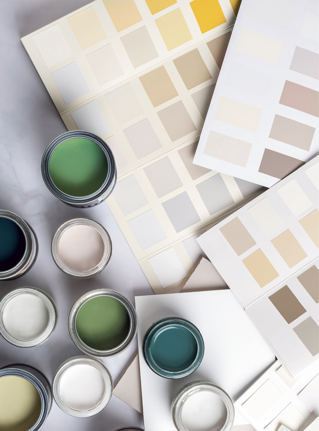
NCS- Natural Colour System 1979
This system was developed in Sweden by Edward Herings thoughts on color at the end of the 19th century. NCS indicates how we perceive color and is the standard in interior design, completely independent of paint manufacturer. NCS has six elemental colors; yellow, red, blue, green, white and black. The NCS Index 2050 color chart contains all 2050 NCS standard colors and a designation consists of both shade and hue.
This makes NCS unique and it gives us a language to communicate color between all stakeholders in a color process to ensure that the end result is what was intended. NCS has also developed various tools to facilitate the identification of color on different surfaces. Fantastic tools that facilitate our daily work as decorators and concept developers.
Pantone is a large selection of colors that are constantly being developed. These are mainly used to name color in interior design on textiles and interior details, but also in print.
RAL is mainly used to name the color of sheet metal and metal parts and consists of a limited selection of colours, approx. 200.
The paint manufacturer creates its own color charts and systems to distinguish itself from other makes to create something unique. They are produced by specialists in the area and the colors usually fit well on large surfaces. They work closely with trends and demand and offer great inspiration!
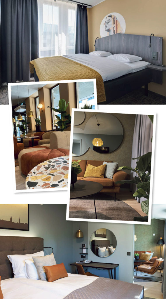
We at PMI are constantly working with colors and materials. Everything to create something unique and well thought out for our customers. Do you have thoughts on renovating or improving your areas in the hotel to create an experience for your customers? Do not hesitate to contact us today.
Things to think about when working with colours
A color is never experienced alone, it is constantly influenced by surrounding colors. What then is a color? A color is a visual impression that is reflected light which we perceive with our eyes and interpret in our brain. What we see is entirely dependent on light, an object that reflects the light and our eyes perceive what we see. Without light, color would not exist.
We all know how we feel on a gray and cloudy November day. Color gives energy and each color stands for different energies. Exciting thought that we can boost our everyday life with color to change our mood. Color setting should therefore not be something that is hipped forward in the hope of the best, but a strategic choice depending on which feeling you want to highlight.
A COLOR IS CHANGED WITH:
LIGHT: The walls will change color depending on whether it is morning or evening and in which direction the room is located.
MATERIAL: A green wall color will differ when the same green color appears in a material.
SHAPE: Depending on the shape of the material, the color will be experienced differently.
Are you one of those who have painted gray at home? Gray and greige have clearly become the new white and a strong trend for a long time. Perhaps in that choice you have experienced that the gray color on the color sheet in the store did not look as good at home in your north-facing room? The target image was a warm gray tone but instead it was drawn to a cool light blue color. How to avoid this problem?
The best tip when painting is to buy home samples from the paint shop with different shades of the color in mind. The biggest mistake is to paint these on the intended wall, next to each other on small surfaces. As I said, colors are never experienced alone, but are constantly influenced by colors around. Rather, paint the colors on different discs that you can move around the room during the day to see how it is experienced in different lights. Do this with all the samples, but not at the same time, but each one separately.
Also remember that a color is perceived stronger (more chroma) painted on a larger surface. The color charts that are available in paint stores usually have colors that are designed to look good on large surfaces. Start there and try your hand, why not paint the ceiling in a different color while you're at it?
Another important choice when it comes to color is the gloss rating. The same color that has a high and a low gloss number will reproduce the color completely differently. The degree of gloss or gloss number is indicated on a scale from 1 to 100 - where 1 is completely matte and 100 is completely glossy. Matt surfaces absorb light, which means that a color code painted with a low gloss number is perceived as darker. Shiny surfaces, on the other hand, reflect the light more and are then perceived as brighter.
MATTE WALL COLOR
Advantage: More forgiving and hides blemishes. Gives a calmer surface without reflections.
Disadvantage: Not so durable, stains and scratches more easily. May be more difficult to wipe off.
BLANK WALL PAINT
Advantage: Easier to wipe off and keep clean.
Disadvantage: Any unevenness is much more visible when working with a glossy compared to a matte color.